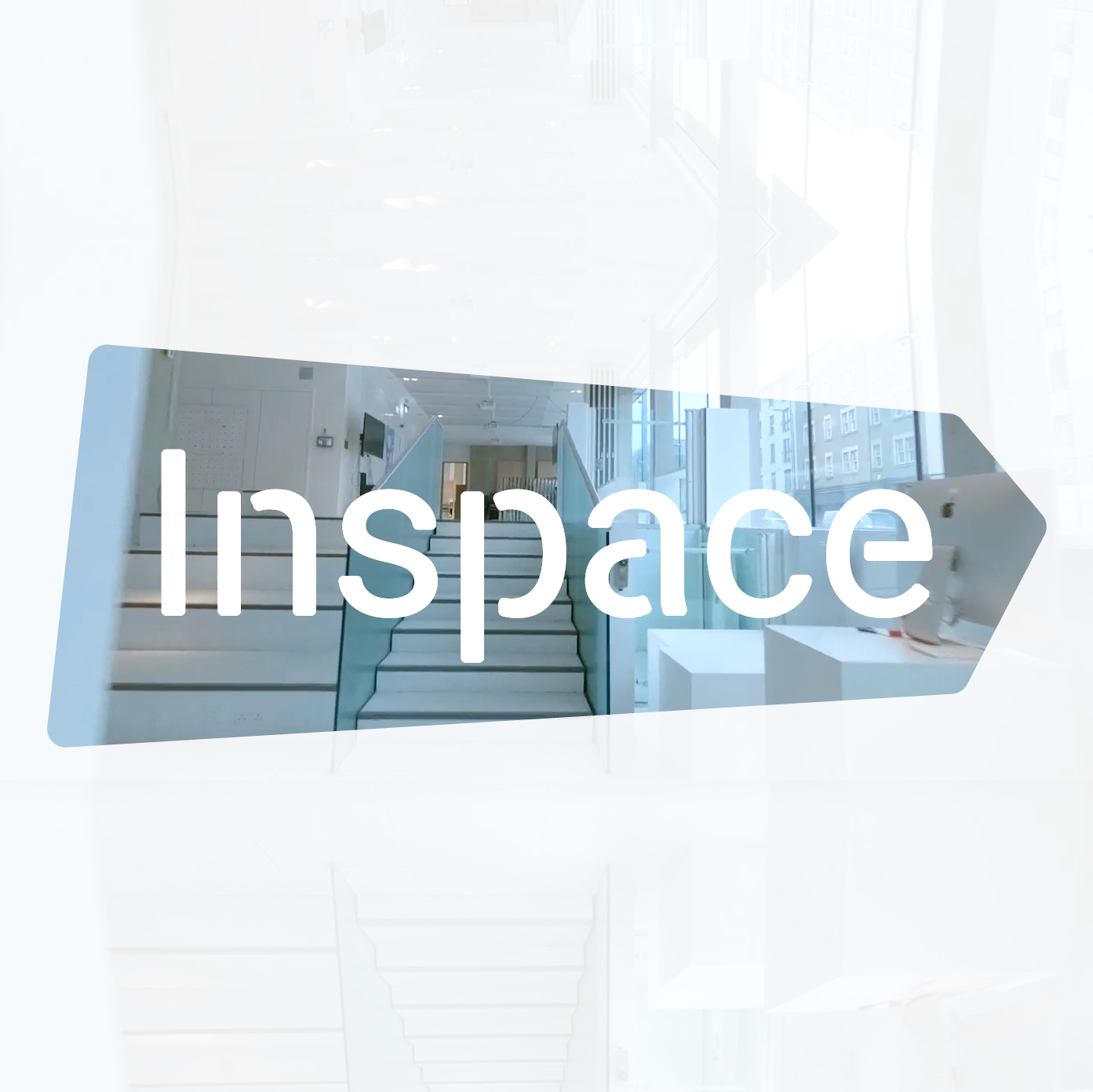
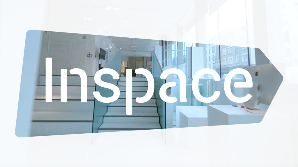
We are excited to share our newly refreshed logo and branding which has been reimagined and redesigned in collaboration with graphic designer and DI PhD candidate Billy Franks.
As the starting point for this refreshed design our approach was to lean into the unique and progressive architecture of Inspace and the digital, technology and data driven works that we platform, as the inspiration. The design process included experimentation with organic shapes, angles and curves to reflect the many screens, surfaces, and levels that characterise Inspace.
Inclusion and accessibility are central to Inspace and Design Informatics’ values and vision. To ensure this translated to this logo refresh, we incorporated into design process a review of Inspace typography, to improve visibility and readability of not only our logo but to also how our typography is applied across communications.
Inspace now plays a central role in Design Informatics public engagement and collaborative work with creative practitioners and artists, and you can check out the Inspace updated vision statement to find out more about the space, our approach and the work it enables. The resulting logo seeks to represent this vision and the journey of Inspace, and its role, past, present and future, as a unique collaborative hub and venue for engaging communities with technology and data in new and evolving ways.